The Initial Idea for a Report
Sometimes, no matter how hard you try and push down one avenue of delivery it just is not going to work; stepping back and looking at the whole problem sometimes results in a more complete (and at times easier) solution.
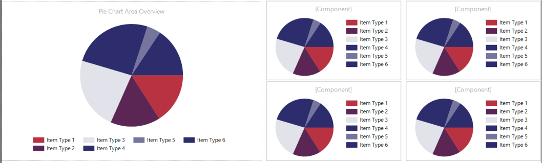
I had a report that I was looking to deliver that showed the breakdown of deliverables in an agile development environment by the type of feature delivered (be that a planned story; an unplanned story that came in mid-sprint; or a support task). The interesting aspect was that this development team also had components. As a result you could look at this information in a number of ways including an overall (i.e. ignore components and see what types of work are being delivered overall) or by component (i.e. see which components have the most of what type of deliverable) or both (i.e. one pie graph with each slice being a component-type hybrid).
I removed the idea of the component-type hybrid because the numbers became too small and it was one of those not the best of either solution results. The other two had merit though and I wanted to do both (i.e. have my cake and eat it as well). I struck on the idea of having the overall pie graph take up half of the report on the left and then the component pie graphs to be laid out left to right, top to bottom on the other half of the page (and for that to be dynamic based on how many components, amount of deliverables, etc…)
The First Attempt (aka Failure)
So I got to work with SQL Server Reporting Services (SSRS), putting together the overall pie graph was straight forward and once completed I set my sights on my dynamic layout idea. It seemed easy to me at first, I’d use a list control, put the component as the item to list / repeat, copy and past the overall pie graph and limit to the component and then just find the “fill left to right; top to bottom” on the list and I’d be done.

This didn’t work and it didn’t work pretty spectacularly as well; basically the list control blocked out the space seen above and repeats that space blocking (i.e. little pie graph in the upper left corner with space to repeat it three times filled up with space)

This actually makes a bit of sense if you understand that the list control is a free form layout and it was just doing what I had specified; however I did end up hitting a roadblock in progressing this way; there isn’t (or doesn’t seem to be) a way to get a repeating control of this nature (which makes sense; when you think my next request was going to be “if there are five components, keep the spacing and add a scroll bar”; but then how does that print [one of the key features of SSRS]?)
Back to the Drawing Board
It took a while, but eventually I realised I had to allocate the pie graphs that I wanted (at most a four by four grid of them) at design time; and to use the build in capabilities to either assign the correct data (the order of the components and which four to show if more than four) or to hide (if there were less than four)
To accomplish this I used the layout in my ideal screen shot above with the four pie graphs laid out next to the overall pie graph and I then did the following to make it all stick together:
- Added a ROW_NUMBER() based on COUNT([Id]) of deliverables (this would be used to determine what data goes in what graph (and if the graph is visible)
- Duplicated the component pie graph data four times with a parameter that would limit to ROW_NUMBER() so each graph would get just the data from that component (note: the numbers 1, 2, 3, 4 were hard coded, but because we were getting a ROW_NUMBER based on count 1 was always the component with the most rows of data)
- Set the Visibility.Hidden field on each pie graph based on if there was data or not
This then accomplished the task we desired, because of the ordering of the pie graphs, if there were more than four the five biggest contributors to the overall were shown (in order of size) and if there were less than four it would layout from left to right, top to bottom, for the same reason.
Conclusion
At times there felt like there had to be a better way, but in particular because of the nature of printing or emailing or PDF generation in SSRS it made some sense you couldn’t have some odd dynamic layout (yet). Once I understood the desired outcome enabled be to fix the layout (but not the data) then I was in a great spot (as that is the general method of operating in SSRS). In the end using the above technique I was able to get that ideal layout I had initially hoped to deliver.
